

Everyone
is the winner.
Demographic portraits don’t work anymore. Yesterday teenagers, middle-aged or elderly people, females, males or none of the above – all them can have nothing in common in terms of statistics, but share a passion point. We believe that the only way to create a product that would become that passion point is to mix the best practices and spice them up with new ideas and creativity, making the product flexible and adaptive to the habits and needs of users.
Background
Nowadays gambling, like no other industry, is going through times of contrasts, rapid changes and high competition. To remain relevant and in-demand, products need to meet the requests of different group... read more
Research
Research design. From the very beginning, we had several hypotheses, but our main goal was not only to focus on solving the existing problems but as well identify new opportunities. To achieve the best results, we us... read more
Main features with significant changes
We figured out that one of the main opportunities for development is the engagement of the new audience that is used to multiple screens, quick actions and a short time of interest without additional stimuli.
Our next goal was to resolve that within the most significant interface elements while keeping it simple and not stressful for classic users.
Flexible and
multi-purpose SIDE BAR
with quick navigation

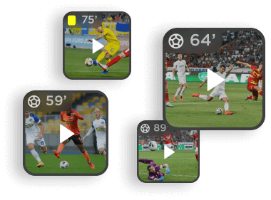
Line up
moments
Reimagined
Betslip
Smart breadcrumbs
Hourly drop
Made for You
Multi-view
As mentioned, it was important to keep the classic patterns for conservative users. That’s why the new features are integrated seamlessly.
Unique functionality of the home page
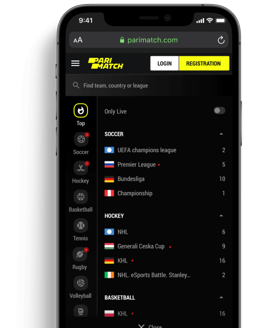
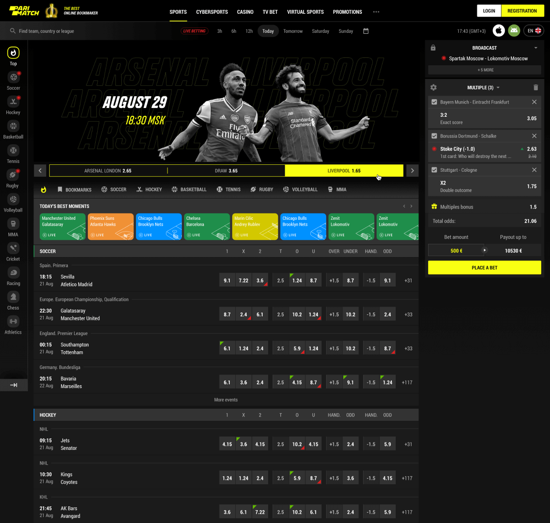
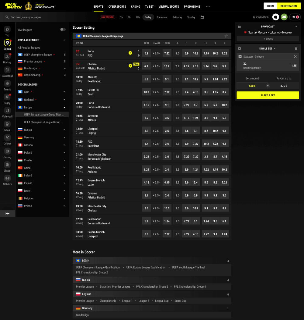
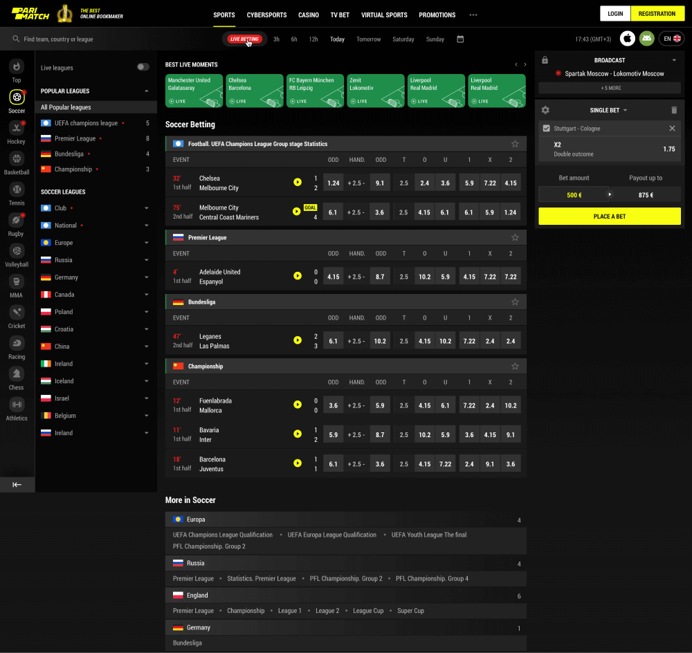
The most valuable users who bet on a regular basis use the main page as their entry point often and the newcomers get their first impression from it. We needed a page that would look both familiar and yet standing out and focused on navigation and deep content filtration, fully using the potential of sidebars and headers on desktop and tab bar on mobile.
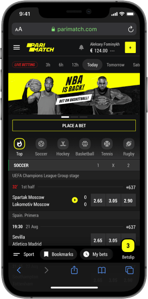
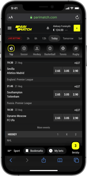
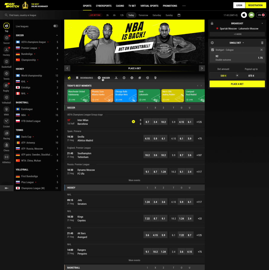
The value of the right use of space cannot be overestimated in such projects. The idea, however, is not only to jam-pack everything as tight as possible but to give enough flexibility – in the case of the sidebar, for example, users can easily collapse it, pressing one obvious button.
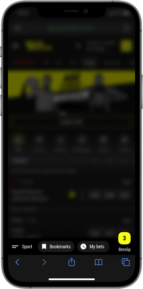
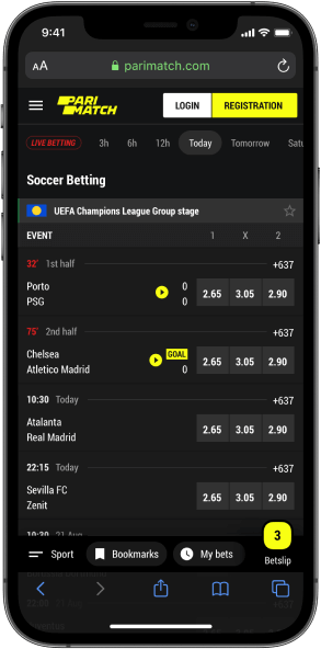
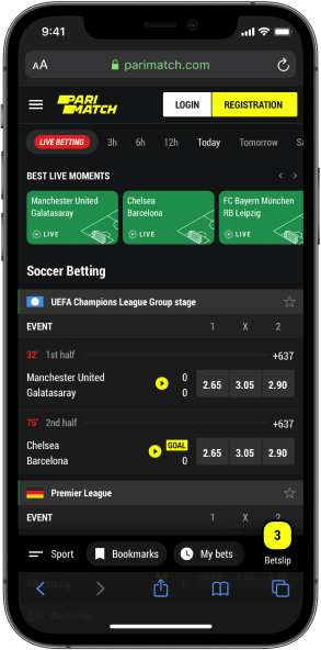
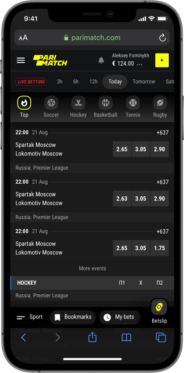
Quick personal navigation is essential for loyal and VIP users and that is why on mobile it went to the most precious location – the bottom bar.
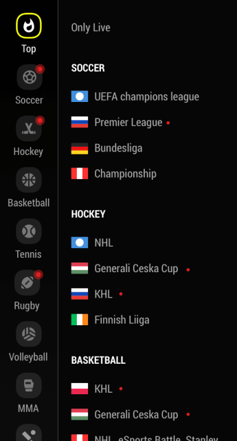
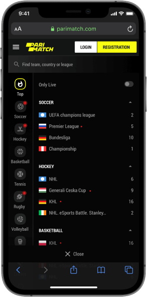
The sports and leagues menu is always there– one tap on the bottom bar brings him to an extended menu with live events indication.
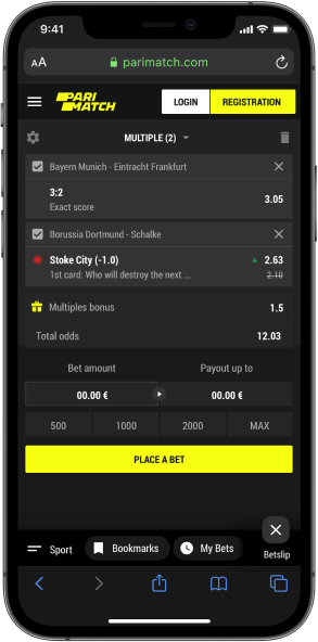
Last, but not least the bottom bar includes its majesty betslip but without even opening it our users can see the number of events added.
Combine all the aforementioned together, add a paramount filtration of matches based on time, yet keep the focus on events and odds and get a top-notch home page – not too overwhelming and not lacking anything important.
Explore sport
events
Finding the right match is highly important, but what is inside it is even more – especially, if we speak about the most valuable customers who bet on secondary markets mostly.
The challenge is to be able to fit all the information on small screens and keep it readable, while on desktop it should be organised in a way not to distract from or overcomplicate the betting process.
Football matches
The most popular sports in the modern betting world (sorry, horse racing) deserves a proper event page in all the states – pre-match, live and result.
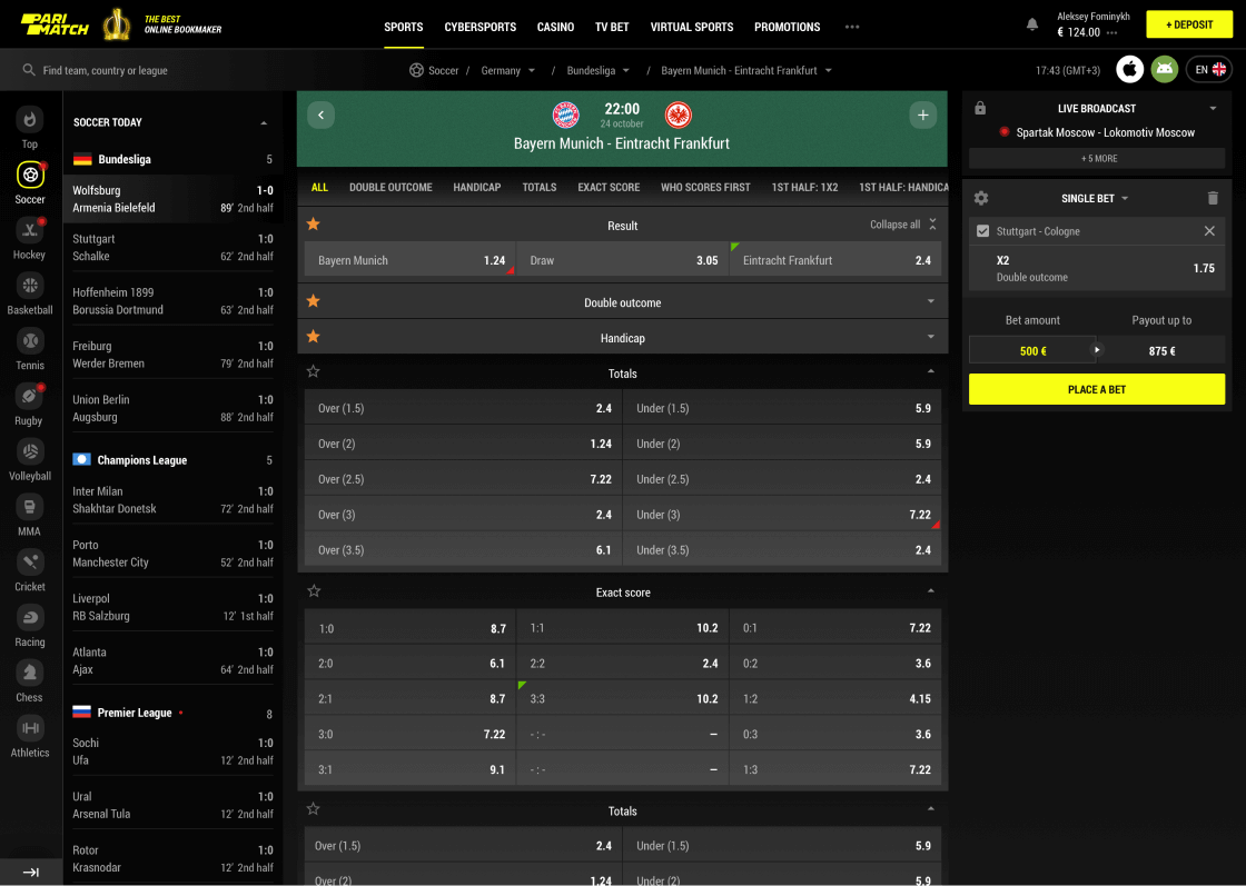
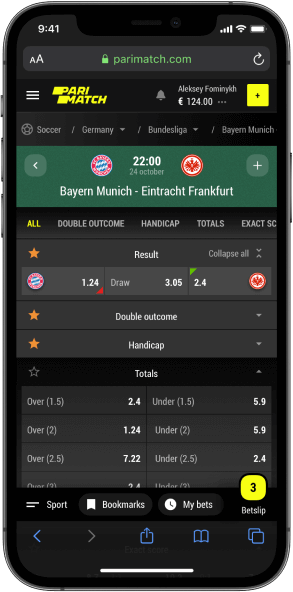
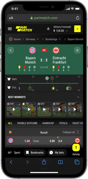
While live, users are able to follow the game in any circumstances and rewind the most important moments to make the right bet.
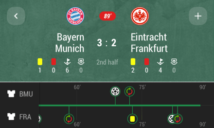
The main stats are right there at the top, allowing users to spend less time for search and more time betting.
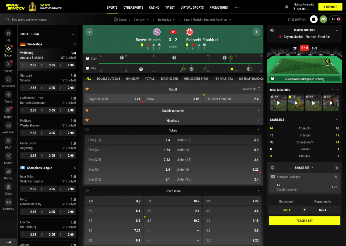
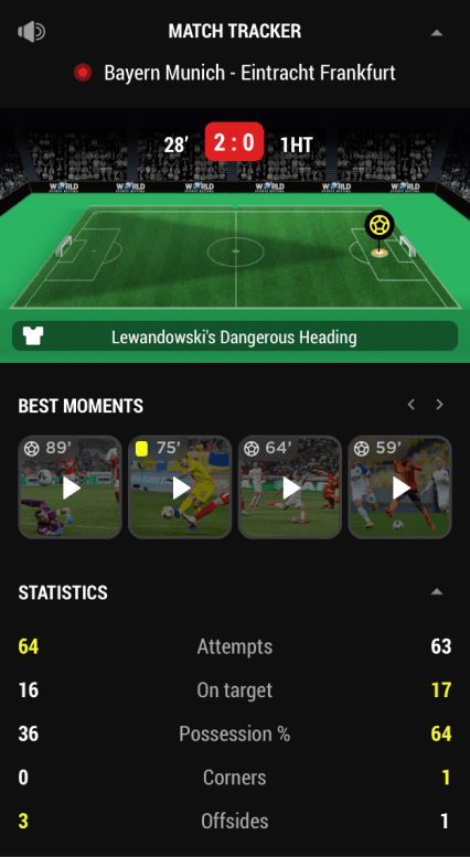
Live betting means quick decisions so our goal was to minimise scrolling through the screens or switching between different tabs.
With the help of sidebars, it is possible to track the game, use the betslip while having all the match odds and other matches’ 1X2 outcomes.
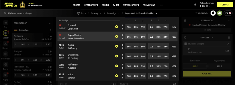
Smart breadcrumbs
bring the UX to a new level
The true virtue of design involves transforming usual things into masterpieces. Why having dull and nominally functional breadcrumbs, when we can make them work as quick navigation?
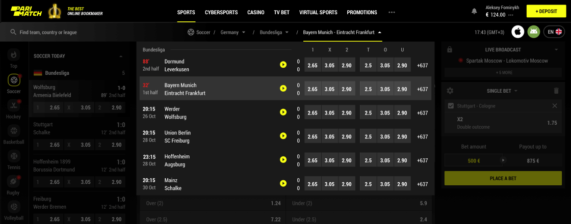
The match part of the crumbs allows users to see the details of other matches and straightaway bet on them.
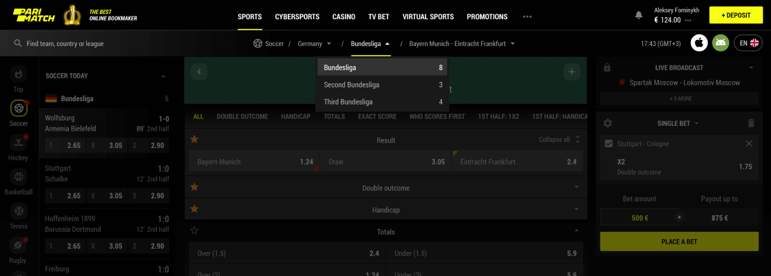
The league part shows all the available leagues within the selected country and the number of provided events within each of them.
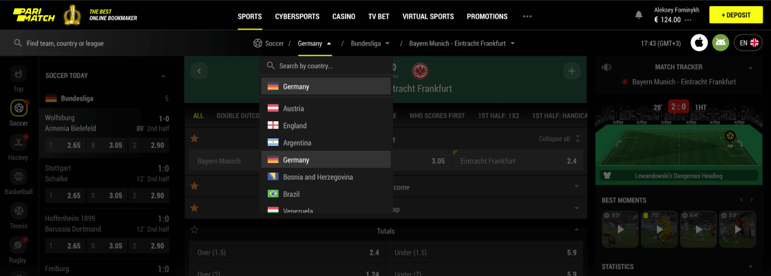
And, of course, users can switch between countries – with no need to remember the alphabet as there is a search there.


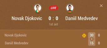
Tennis matches
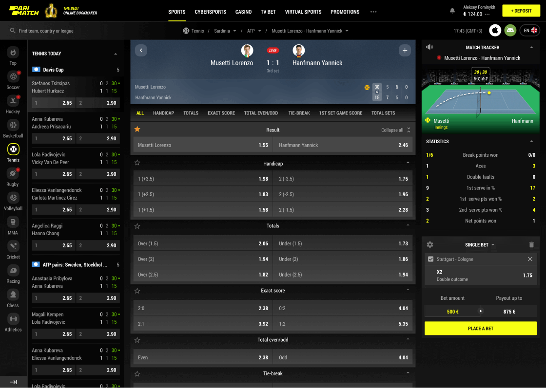
It may seem that all the event pages should be duplicate but in reality, some should vary – for instance, tennis could not be the same as football.
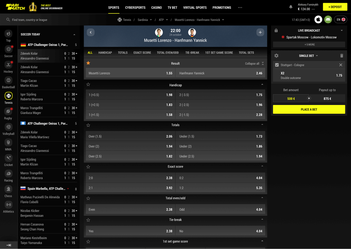
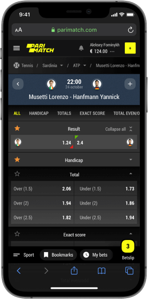
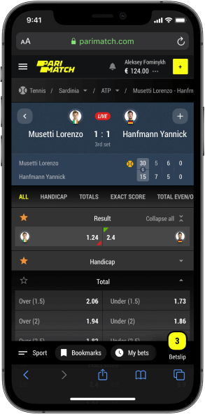
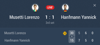
The main difference may be seen when the game is live as not only the data and markets differ, but also there is an additional score.
Traditionally, it includes the details on the current game, sets, overall results and who is serving.
Multi-view
for multi-screeners
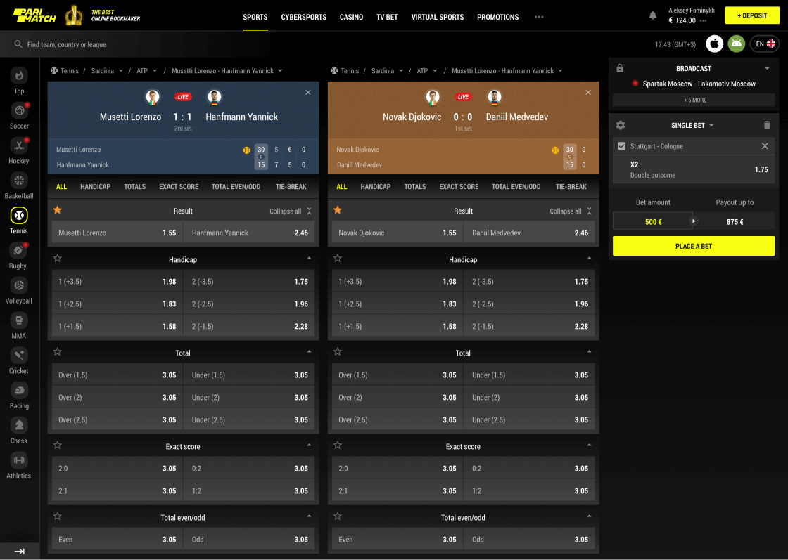
In gambling, each second counts. When in live, people tend to follow events and bet instantly and sometimes in parlays (multiple events within the same bet). That means they need them constantly on their screens, but is it possible?
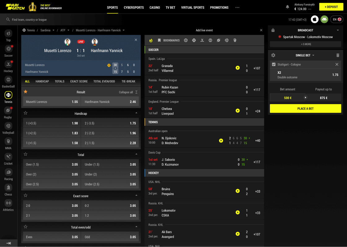
Apparently, standard widths of modern screens give us enough room to show several events at the same time or search for a second one while keeping an eye on the first. Live betting just got way better!
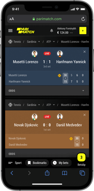
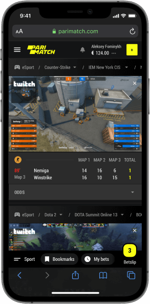
What about responsiveness? Inconceivably, but apparently, it was possible to fit 2 events on one standard mobile screen.
To make it happen, we came up with collapsable odds sections. It is a minor sacrifice as once anything important happens, the odds are right there.


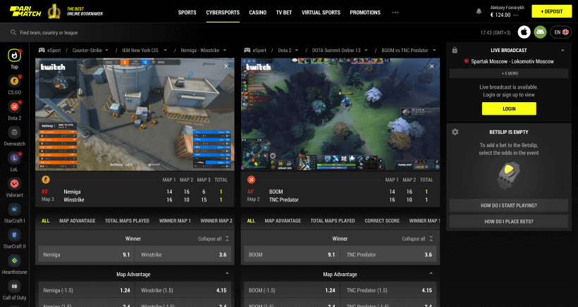
Cybersports
is the new black
As yesterday teenagers grow into the core audience and considering the pandemic shift, cybersports gain a special role in bookmaking. Yet still, the audience of sports and eSports betting is partially different (and the betting process), that is why those events go into a separate section.
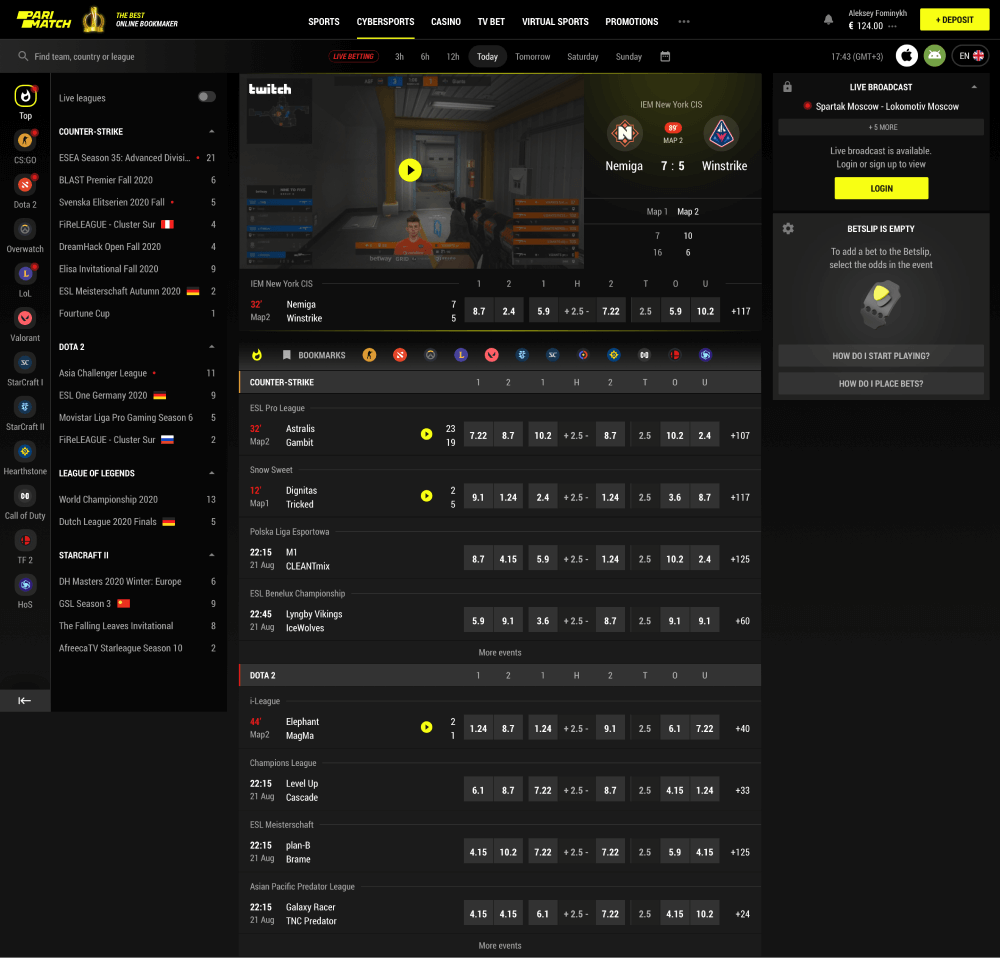
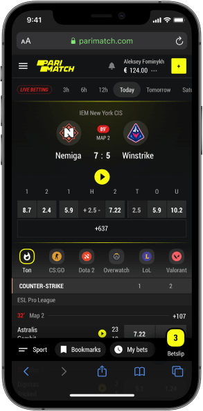
Сybersports events
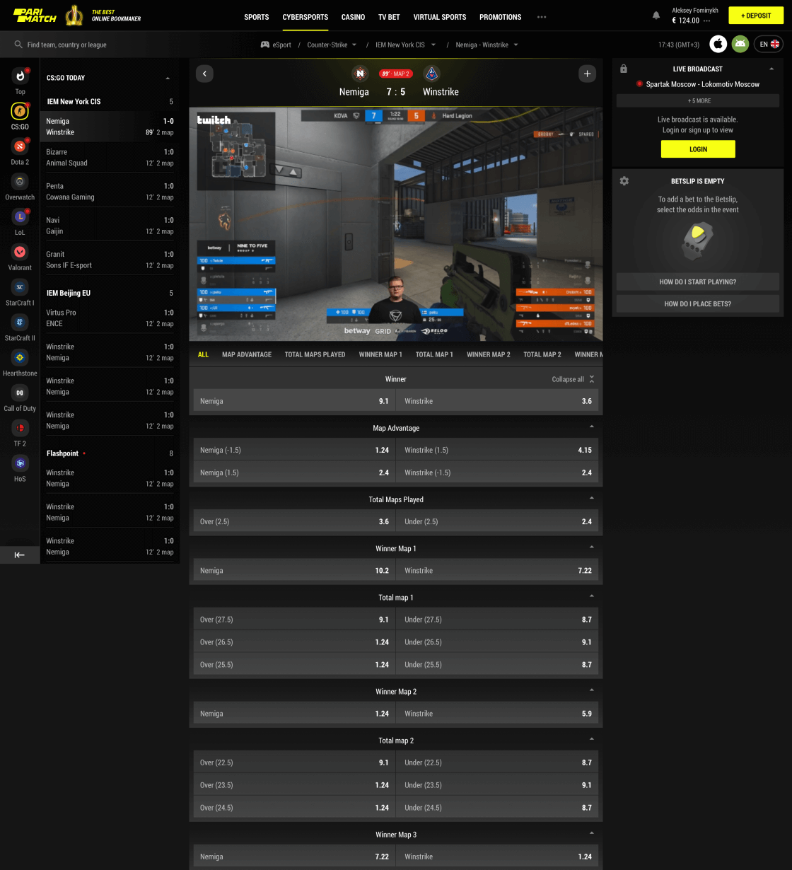
Dynamic and unpredictable as cybersport is, eGames are quite fun to bet on. Especially, when the transition from classic sports is made as smooth as possible.
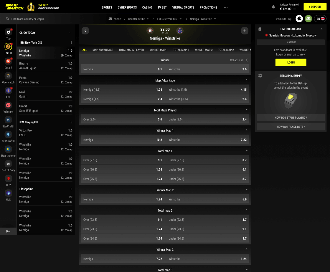

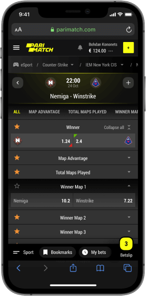
Among the perks of eSports betting, live streaming is definitely one of the most important, making live betting a kicky experience.
As usual, on mobile, it is as goodor even better than on desktop.
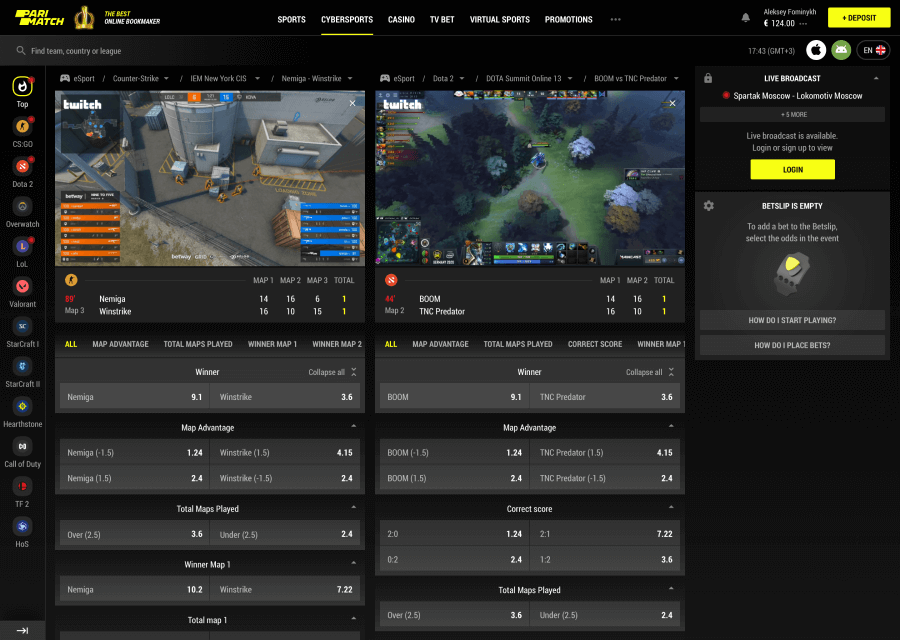
No more switching
to Twitch
Similarly to other sports, users tend to bet simultaneously on live events, but in this case, they often need to follow both games’ livestream. Thus streaming multiple events and allowing betting on them at the same time helps Parimatch beat even Twitch.
Casino. Designed
to match any taste
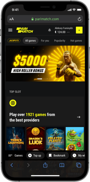
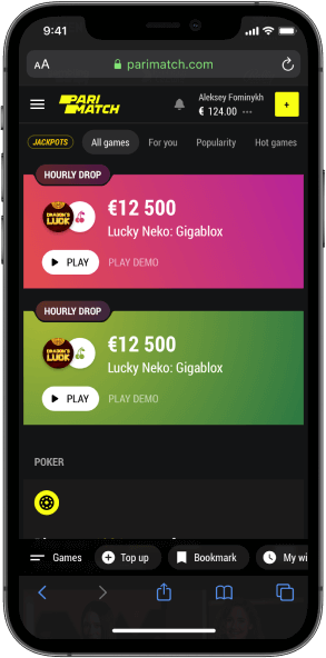
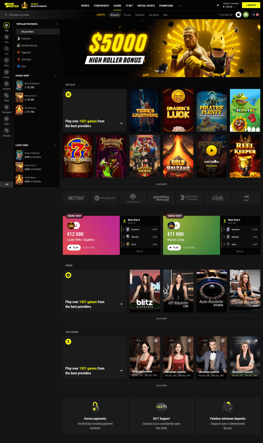
Parimatch is a strong brand that extends beyond betting only. One of the other activities available for users and beloved by them is online casino. Our focus was to keep the visual and structural integrity here, yet adjusting it to the specifics of user behavior and preferences.
All the suggestions
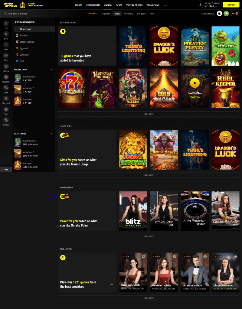
in one place
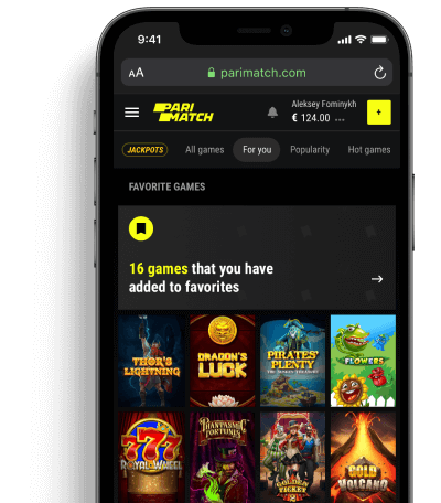
Recommendations and suggestions play the same role in casinos as timing in sports does, being the basement for newcomers and quick access for the loyal users.
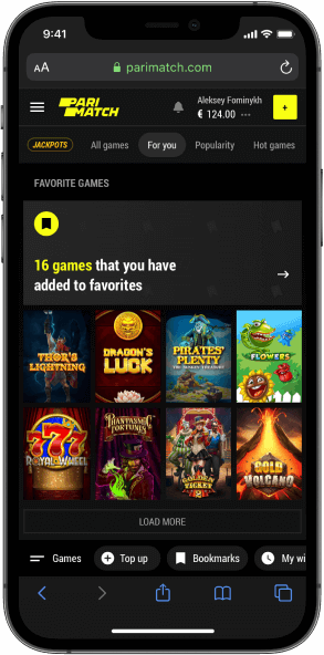
Slots.
Delivering the fun
Slots have been there since the appearance of online casinos and continue to play a significant role. Our focus was to keep them fun and easy to interact with and improve as much as possible.
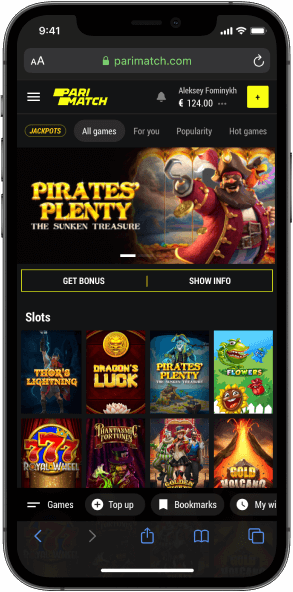
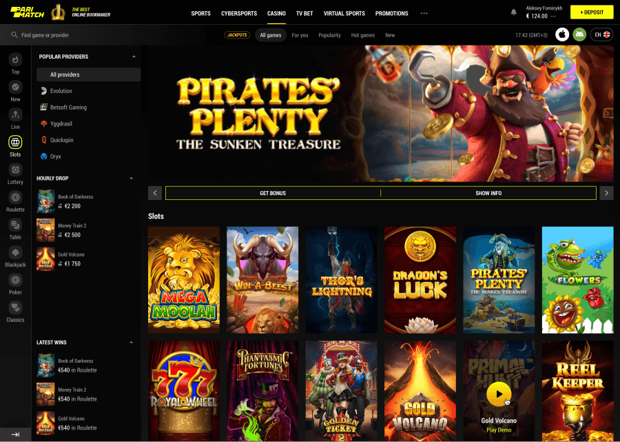


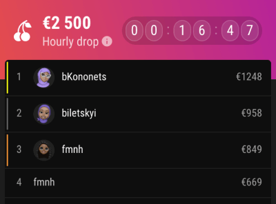
Hourly drops
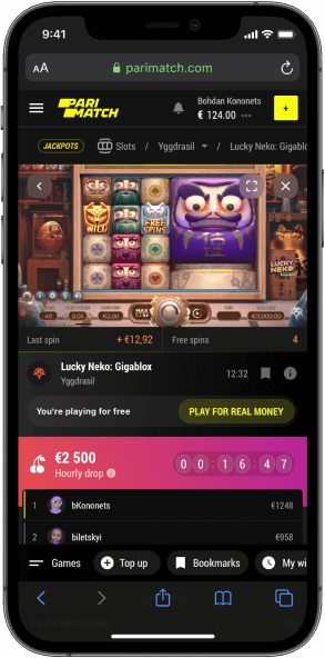
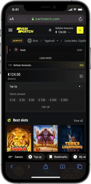
Slots are fun in many ways, but not in social. Neither do they bring FOMO. To improve that, an hourly drop was added – a big prize played up at a certain time.
Slots
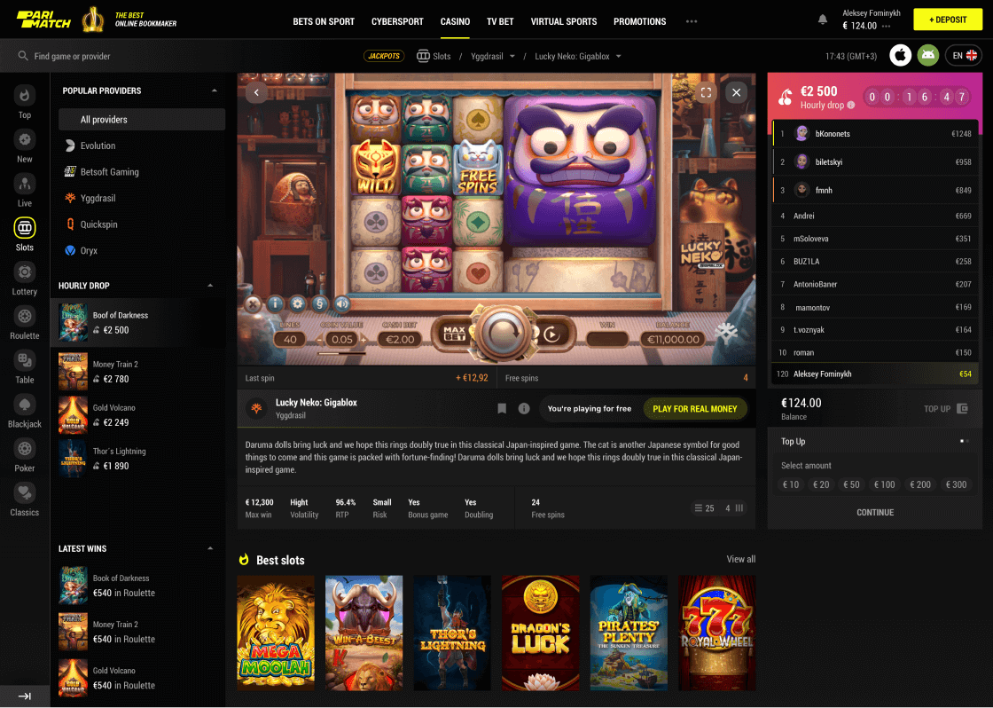
While inside a game, users need to be focused on what is going on and having on the main screen the things that really matter – the gameplay and balance.
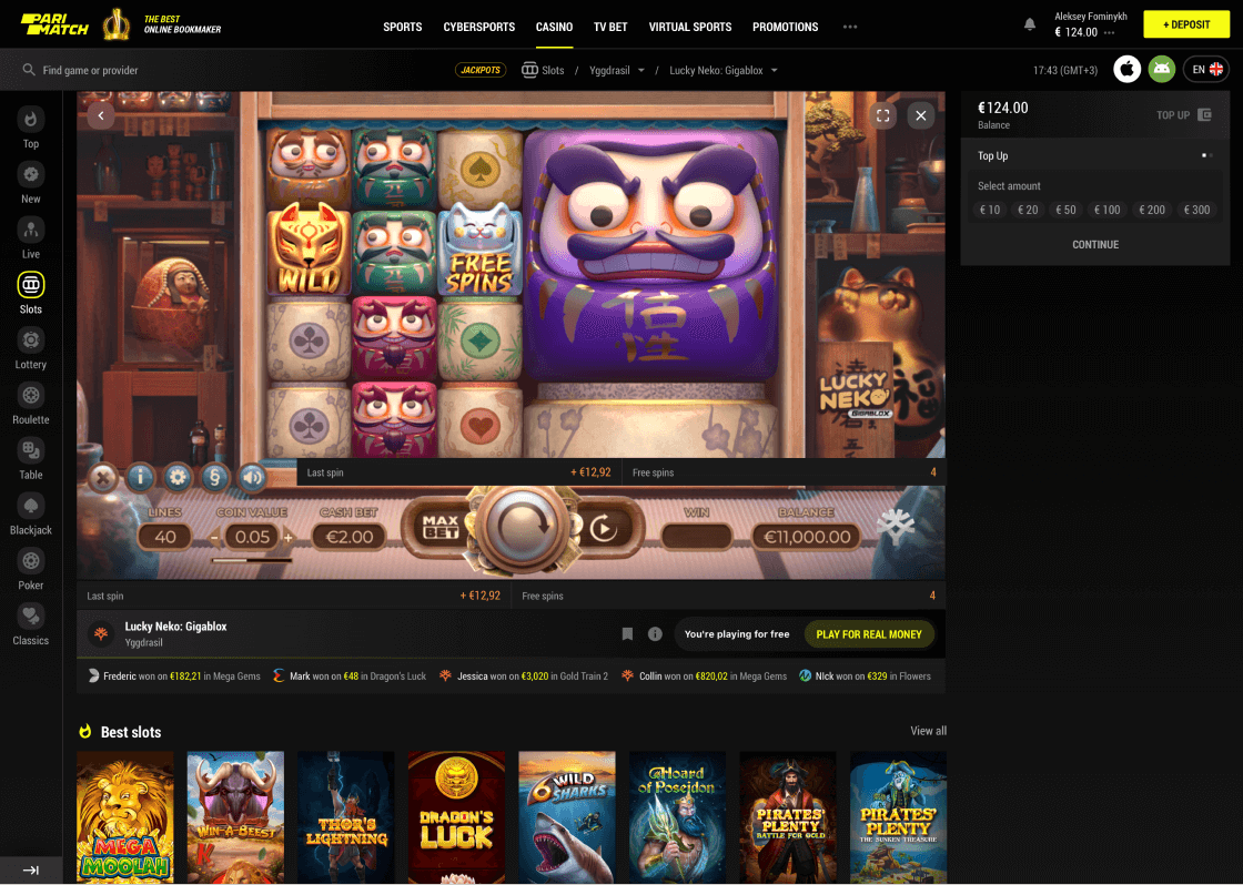
Of course, sometimes users may get tired, but it would be careless to let them just leave.
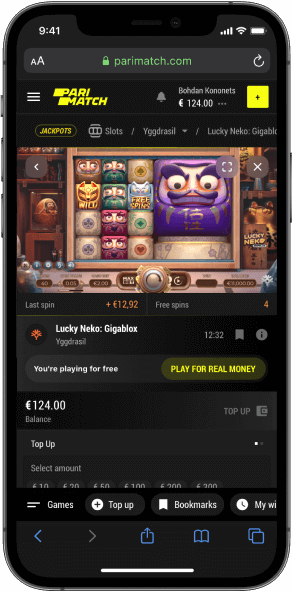
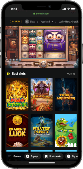
That is why it is possible to explore other games while simply scrolling. The current game stays at the top so no worries that something will be missed or lost.
Multi-casino
to quadruple the joy
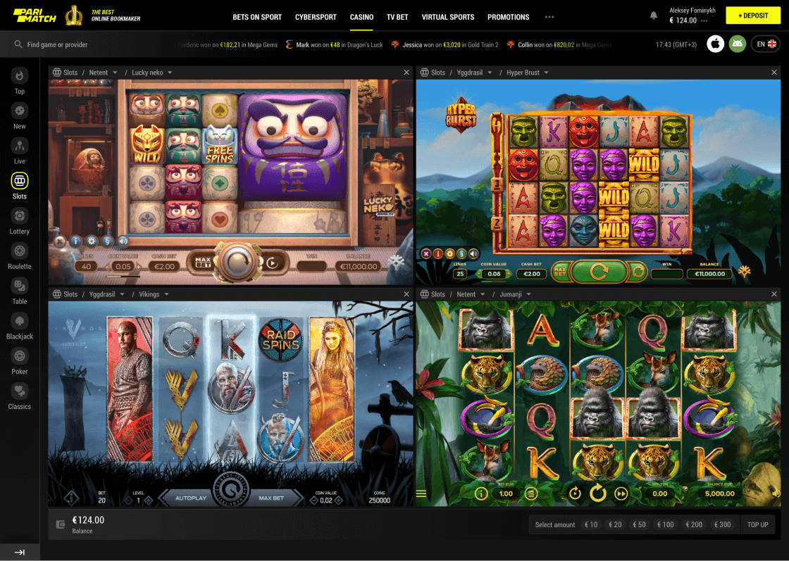
For those who watch videos at 1,5x speed or are used to multitasking, there is a multi-view with up to 4 slots on the same screen. Because if we don’t keep our users’ attention something else will.
Profile now
feels like home
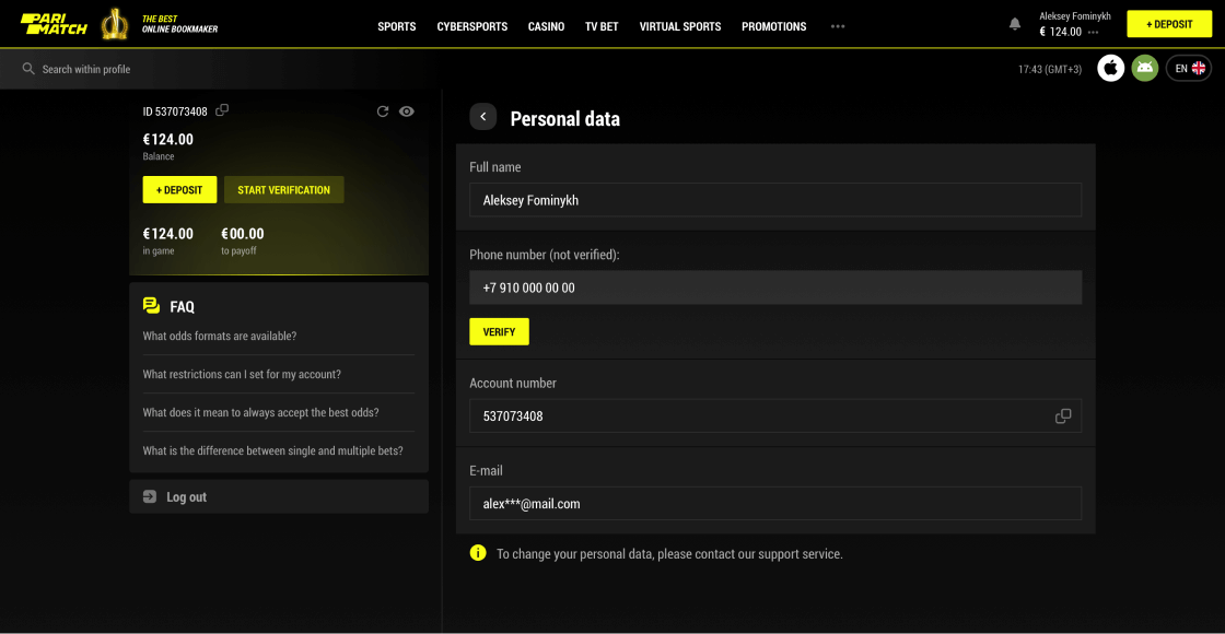
Profile says more about a product than any other part – because ultimately books are not judged by their covers. All the pages related to personal information should be clean, well-structured and give immediate answers to all the questions – even the ones that did not come up yet.
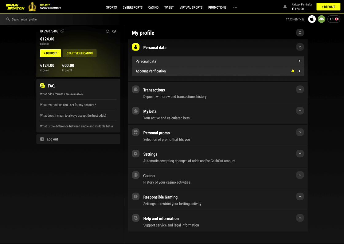
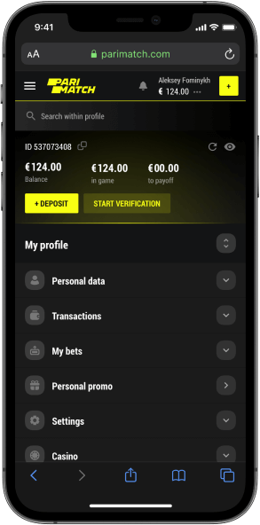
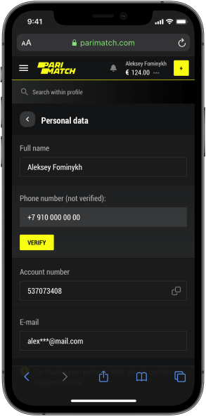
Clean subsections make it easier to navigate both on desktop and mobile and highlight what is really important and needs attention.
The balance stays right at the top with the main numbers.
Deposit
Deposit is one of the most demanding thingsas it has to follow the needs and requirements of three sides – user, business and legal regulator.
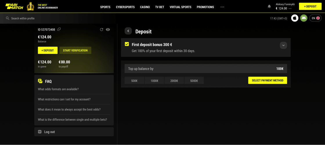
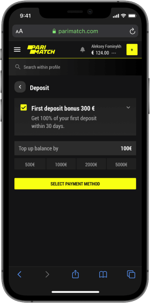
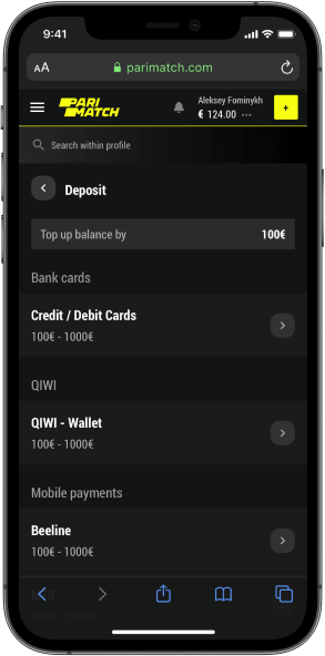
Sometimes reinventing the wheel is not the right thing to do and things that work should be kept that way.
Our goal within the deposit was to improve it by cleaning it up and making it consistent.
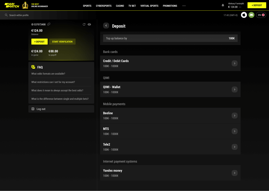
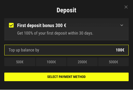
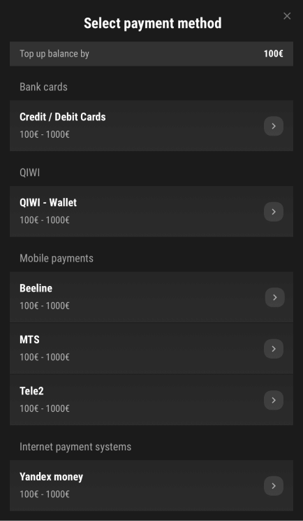
Patterns and well-known flows not only work best for the visual integrity but also positively affect both users and developers’ minds and mood.
It is easy to notice that the deposit modal is very similar to almost every other modal and thus not only the code can be re-used, but also the user is familiar with it.
The best promotions
for the best users
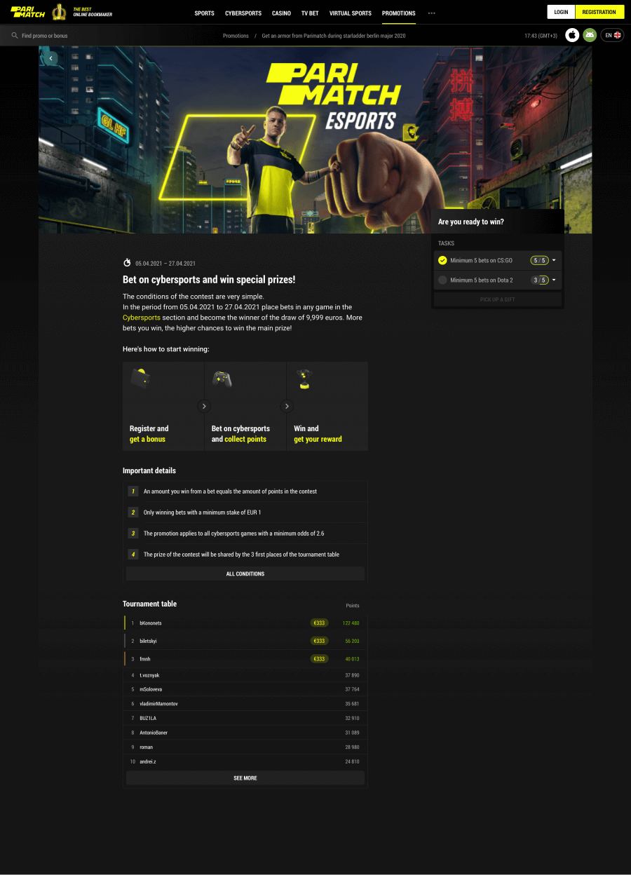
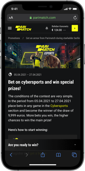
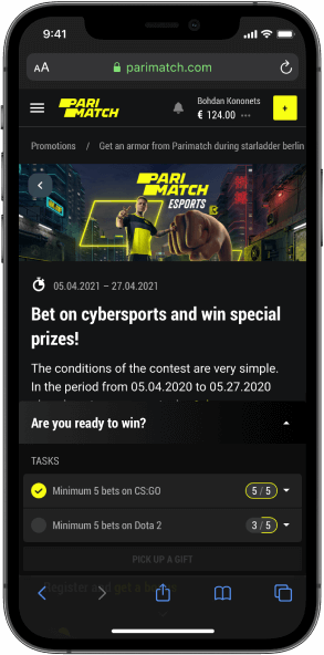
What about all those great promotions? Our idea is to highlight those opportunities Parimatch offers to its users, not hide them. That’s why, firstly, the promo has its own dedicated space – beautiful and easy to navigate, secondly, the link goes in the main header menu.
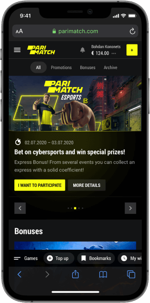

The best promo campaigns are diverse and engaging, usually combining different mechanics. Thus, their pages should be ready to include special tasks, leaderboards and clear explanations of complex rules.


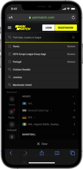
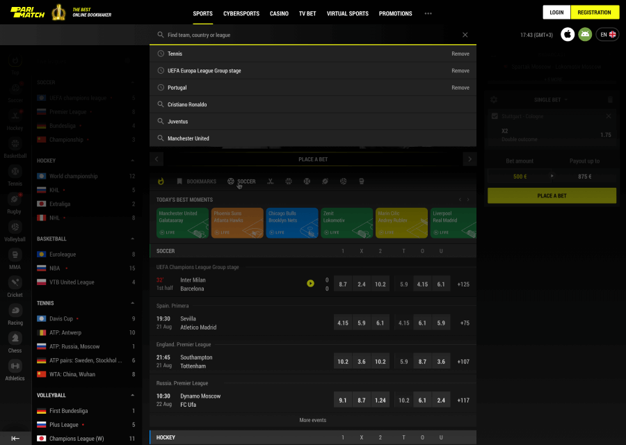
Search for anything.
Anywhere.
Wherever our user goes, search is always there – to make life and betting easier. It contains both search history and suggestions and adapts to a specific section from where it was requested.
Top-notch betslip
is the key
Wherever our user goes, search is always there – to make life and betting easier. It contains both search history and suggestions and adapts to a specific section from where it was requested.
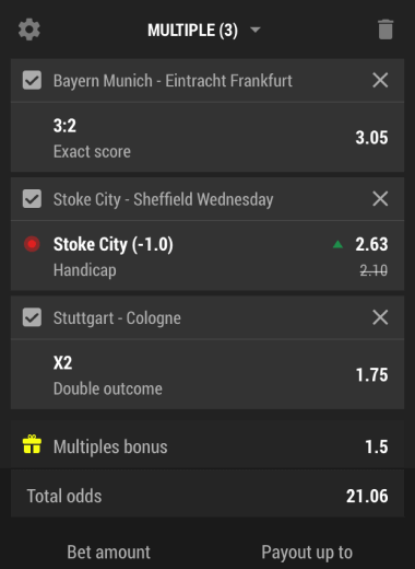
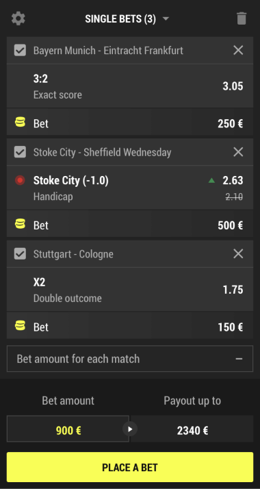
No matter how great the rest of the interface is, the one and only most crucial element is the betslip. It is essential not to break classic user flow and at the same to offer a bit more than other competitors do.
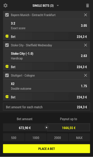
In this design, several small but gold features are added – events selection, payout as an input and quick bets.
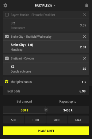
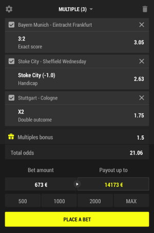
In classic flows, it is difficult for users to switch between different types of bets and almost impossible to mix & match events within one flow.
This is when events selections come in handy. Users can select several events to be placed as single bets while saving others for a multiple bet – or vice versa.
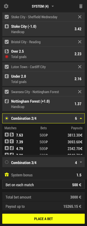
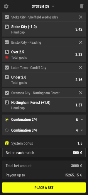
System
Being one of the most compilcated types of classic bets, system always raises questions even among experienced users.
However, it’s the case when not every users needs answers – that’s why we followed our idea of initially hiding the extra feature of outcome calculation explanation, but having it right there.
